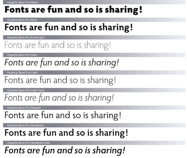
Cosmos BE - Light, Medium, ExtraBold by Berthold
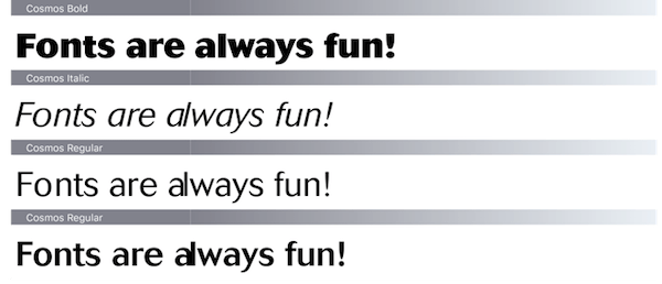
Designed by Gustav Jaeger in 1982, Cosmos is an interesting sans serif with terminals that seem to fade rather than come to a distinct end. This characteristic, however, does not distract the reader. Jaeger said of type design, “To be sure we must appreciate the aesthetic quality of the individual character, the correct type style suited to the subject, but the ‘text image’ should not push itself between the message and the reader. Type must serve.” Cosmos is useful for short passages, signage and display work.
